Each flavor starts with a job: steak night, smoked ribs, cocktail rims, sweet toppings, seafood, vegetables, or seasonal drops.
Why Field & Flame exists
Because ordinary seasonings got too comfortable.
We are here for cooks who want pantry staples with backbone, dessert toppers with personality, and glass-rim flavors that feel like part of the drink instead of an afterthought.
Dark labels, strong flavor names, and sharp visual systems make the line easy to notice and easy to remember.
New blends are part of the brand plan, from core staples to limited releases that keep customers coming back.
Brand direction
Premium, bold, and easy to recognize.
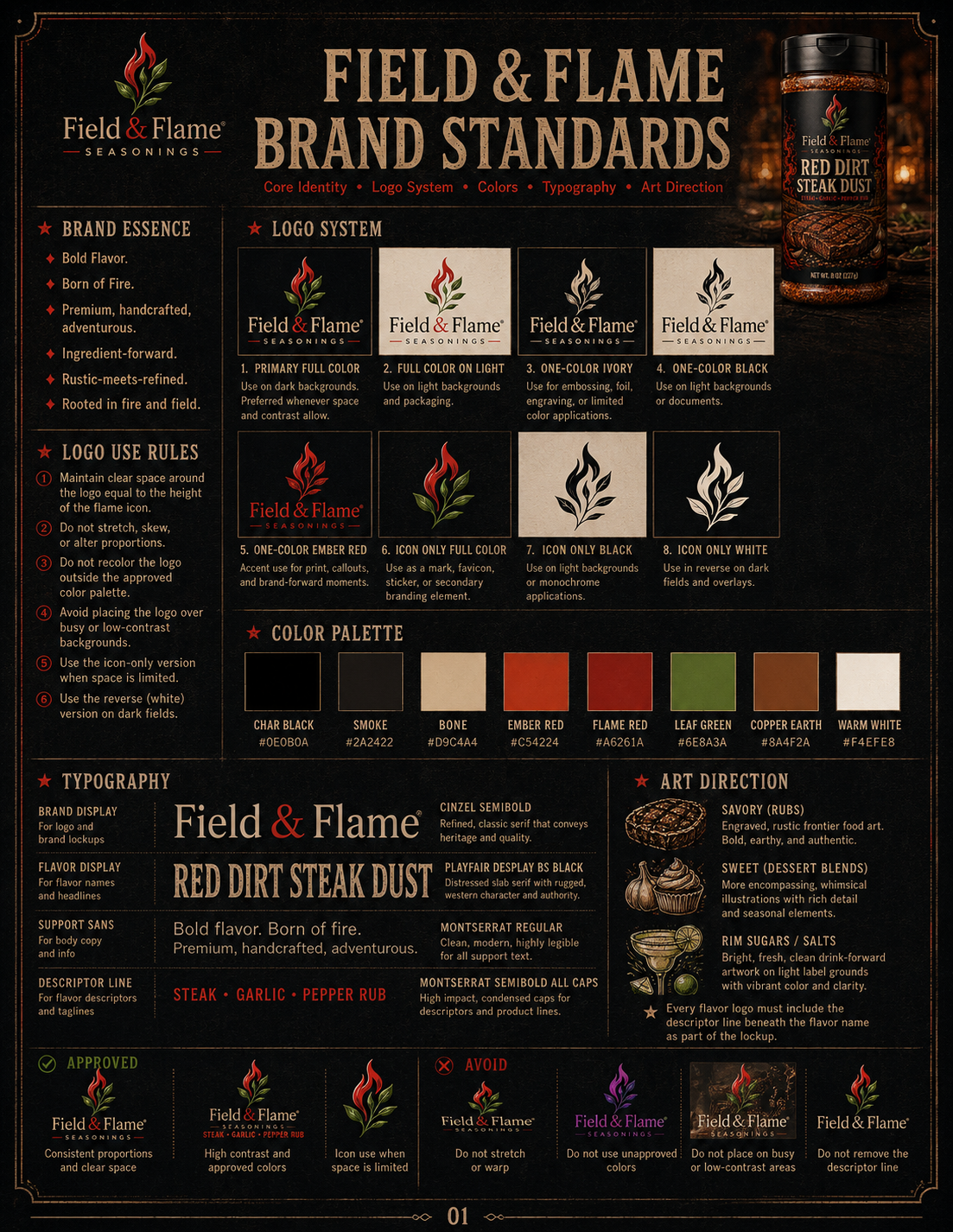
The look is meant to feel dark, crafted, and shelf-ready, with the red flame and green leaf mark tying savory, sweet, cocktail, and limited-release products together.
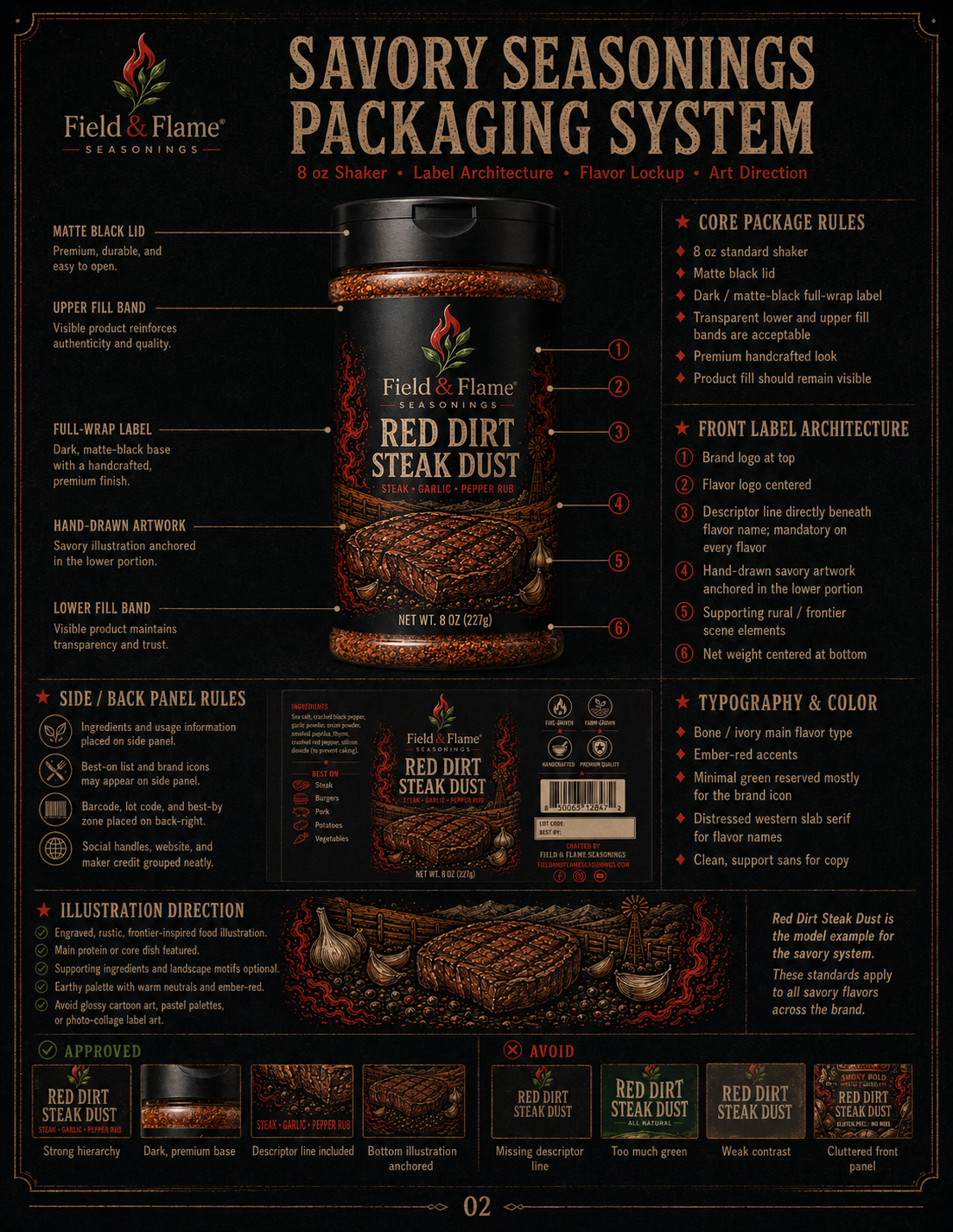
We are treating the brand system like part of the product: clear logo rules, bold flavor lockups, disciplined colors, strong typography, and packaging standards that make each bottle feel connected without making every flavor look the same.
Small batches. Big impact.
Hand-built flavor with modern tools behind it.
Field & Flame is being built like a modern flavor workshop: small-batch thinking, sharp brand systems, visual prototyping, recipe development, digital planning, and practical kitchen testing all working together. The goal is not to make random novelty blends. The goal is to make focused seasonings that look strong, cook hard, and give customers a reason to remember the name.
We use the tools available to us to move faster and make better decisions: digital mockups to test shelf presence, structured flavor notes to keep each blend clear, packaging systems to protect brand consistency, and content tools to help show each product in the context where it belongs.
Batch-minded formulation
Modern creative workflow
Visual product testing
Real-use kitchen direction
Define the job
Every blend starts with a practical reason to exist: what it goes on, what it should improve, and why a customer would grab it again.
Build the system
Flavor naming, art direction, package hierarchy, and usage ideas are developed together so the product feels complete before it hits a shelf.
Test for impact
The best blends need more than a cool name. They need aroma, texture, visual appeal, and a clear food moment that makes sense fast.
Refine the release
Small batches let us sharpen the final direction, learn from early supporters, and keep room for limited drops and new ideas.
A lot of seasonings are built to be safe. Safe can be useful, but it can also be flat: too salty, too dusty, too forgettable, or dressed up in packaging that says more than the blend delivers.
Field & Flame Seasonings is being built around a cleaner idea: flavor should have a job. A steak blend should make meat taste deeper and more fire-kissed. A citrus seasoning should wake up grilled chicken, vegetables, and seafood. A sweet blend should make pancakes, yogurt, oatmeal, coffee, and baked treats feel intentional. A rim sugar should make the first sip better.
We are creating collections that feel modern, premium, and easy to understand. The Core 12 covers everyday grilling and cooking. Sweet Seasonings bring dessert-style flavor to breakfast, drinks, and treats. Rim Salts & Sugars give cocktails and mocktails a stronger finish. The Flamecraft Collection pushes bolder names, hotter profiles, and bigger visual energy.
The brand is still in preview mode while we prepare for the next stage. This site is here so customers, early supporters, retail partners, friends, family, and the flavor-curious can see what Field & Flame is becoming before the Kickstarter opens.
Built For Heat
Grills, smokers, cast iron, ovens, air fryers, and late-night kitchen experiments all deserve blends with purpose.
Flavor With Shape
Each product has a clear lane, a clear mood, and a reason to earn its place in the lineup.
Shelf-Ready Vision
The package direction is bold, dark, crisp, and instantly recognizable as Field & Flame.
Kickstarter First
We are building the audience before opening orders, so early supporters can help shape the launch.
The short version
We think the seasoning aisle can do better.
More character. Cleaner purpose. Stronger visuals. Better reasons to reach for the bottle.